Evolving
a Design System
into a global standard
Context
The Migration Plan was a strategic initiative I led as part of Ambev Tech’s Design Ops team to consolidate parallel component libraries into the Celebration Design System.
As products evolved, teams began creating independent libraries to meet immediate needs. While this preserved delivery speed, it gradually introduced inconsistencies and weakened the system’s role as a single source of truth.
More than simply consolidating libraries, the plan aimed to create a sustainable ecosystem where components, tokens, and shared practices could be maintained and evolved in a structured way across teams. It marked an important step in the evolution of the Design System, improving development efficiency, creating a better experience for designers and engineers, and bringing greater coherence to the company’s digital products.
Company
Ambev Tech
Role
Project Lead
Team
4 Designers
3 Developers
Timeline
Jan. to Sep. 2025
Tool
Figma
Key challenges
- Integrate two active parallel libraries without disrupting product delivery;
- Eliminate duplication while maintaining delivery speed;
- Making sure product teams’ needs continued to be met during the migration;
- Removing friction and bottlenecks while merging the libraries;
- Balance immediate product demands with long term system health.
Main goals
- Consolidate parallel component libraries into a single shared Design System;
- Increase organizational efficiency by reducing redundant design and engineering efforts;
- Restore consistency across products;
- Preserve product specific needs while merging libraries;
- Strengthen Celebration as the company’s global standard.
My role
I defined the overall direction and operating model in collaboration with three designers. I structured the migration strategy, clarified decision making flows, and ensured alignment from architectural decisions to final delivery.
Beyond leading the initiative, I remained hands on throughout the process. I reviewed and refined components, aligned patterns across libraries, and ensured that every published element met a consistent quality and architectural standard.
This role required navigating technical trade offs, product priorities, and cross functional alignment to reposition the Design System from a reactive support layer into a strategic platform.
Project
System audit and discovery
The project began with the identification of two active parallel libraries used by some of the company’s most strategic products.
I facilitated working sessions with the designers responsible for each library to understand the motivations behind their creation, the product needs they addressed, and the perceived limitations of Celebration at that time.
This phase ensured the migration was grounded in real product requirements rather than treated as a simple consolidation effort. The objective was to preserve valuable learnings while strengthening the system as a whole.
Analysis and mapping
I led a deep analysis of both libraries to uncover overlaps, gaps, and architectural inconsistencies.
We identified which components could be incorporated as they were, which required refinement, and where new components were necessary. In parallel, I evaluated the impact on design tokens to strengthen the system’s foundational layer and support long term scalability.
This mapping phase directly informed prioritization and sequencing decisions.
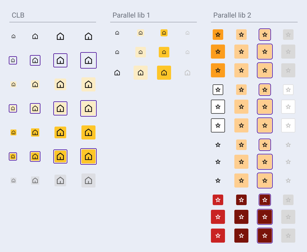
Comparative component analysis: Button Icon across Celebration and parallel libs.
Process organization
Based on the insights gathered in the previous phase, I defined a structured migration plan to bring clarity and predictability to the process. I established priorities, organized the work into clear phases, and collaborated with the other designers to distribute responsibilities across the team.
We also aligned on a shared working model, defining how files would be structured and maintained. The goal was to ensure consistency, visibility into the status of each component, and a scalable workflow capable of supporting parallel contributions without losing coherence.
Refactoring incorporated new variables, properties, and behaviors from the parallel libraries to avoid losing relevant product insights.
In parallel, design tokens were strengthened and accessibility improvements were embedded across components, ensuring holistic system evolution.
Component prioritization followed four criteria:
First
Foundational components such as buttons and inputs were refactored early. These elements act as building blocks across products, so stabilizing them ensured structural consistency at scale;
Second
High impact components already widely used within Celebration were prioritized to generate immediate value across teams;
Third
Remaining existing components were aligned with updated architectural standards and token structure to ensure cohesive system evolution;
Fourth
Components created within the parallel libraries and not yet present in Celebration were integrated. Each was evaluated for broader applicability and adjusted when necessary to serve multiple products rather than a single context.
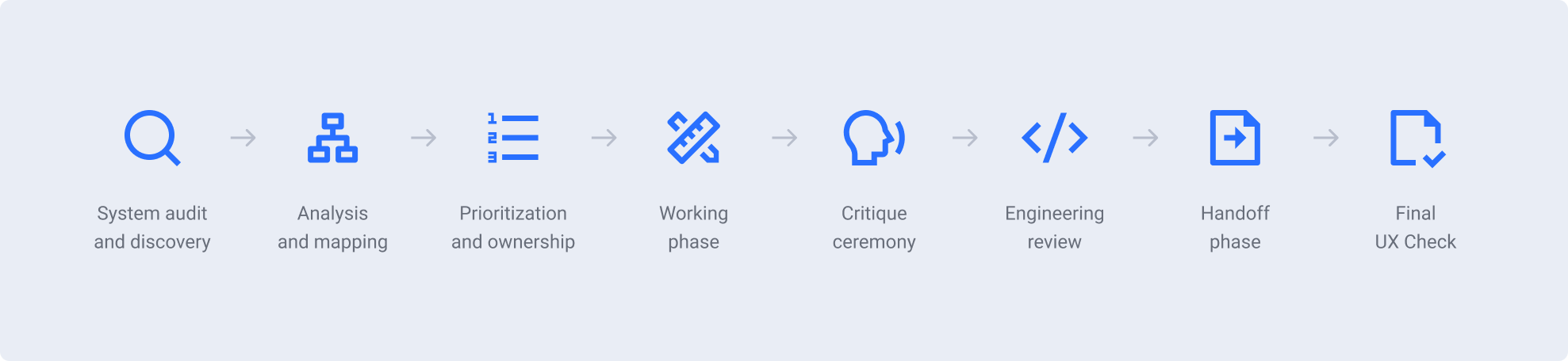
Process flow
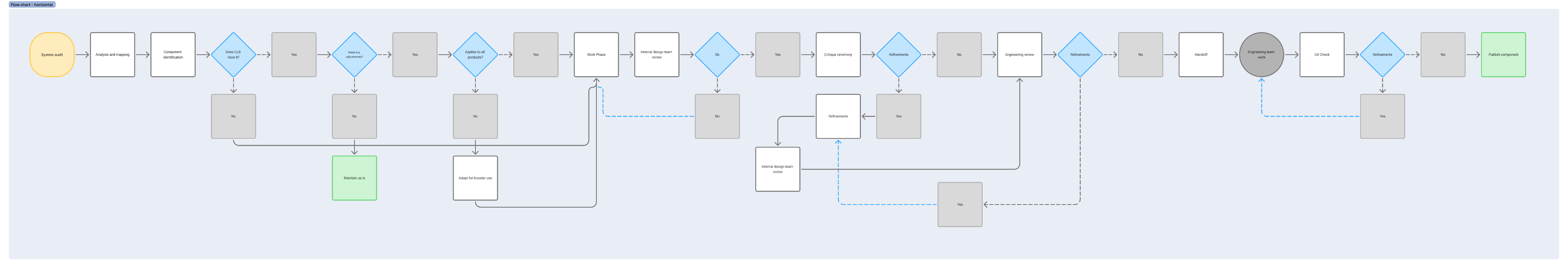
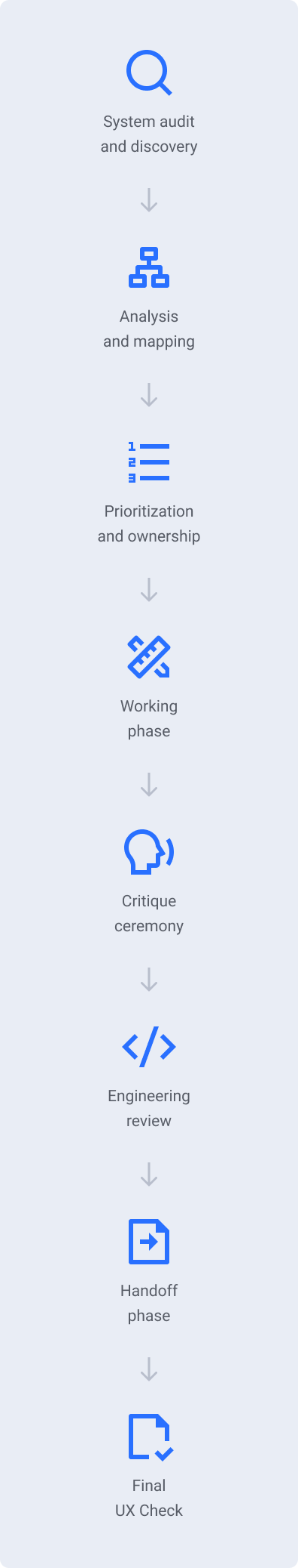
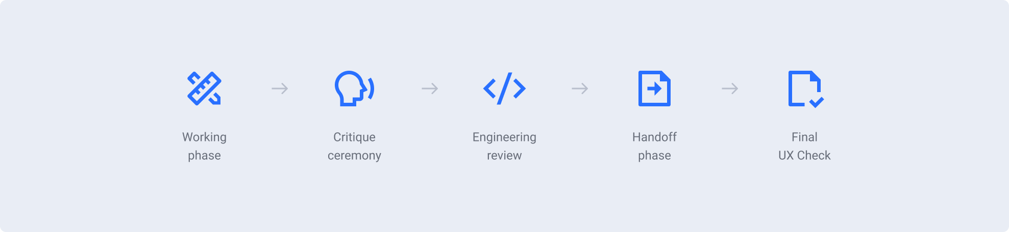
Execution phase
The migration execution followed five structured phases applied after components had been analyzed, prioritized, and assigned. These phases guided the hands on work of refactoring and integration, ensuring consistency and quality during implementation.
The workflow included Working, Critique, Engineering review, Handoff, and UX Check.
Throughout this stage, I facilitated weekly alignment sessions to maintain transparency, surface risks early, and ensure internal peer evaluation before broader exposure to the organization.
A component was only published and made available in the library after successfully passing this review.
The definition of done was achieved only when the component successfully progressed through all five phases.
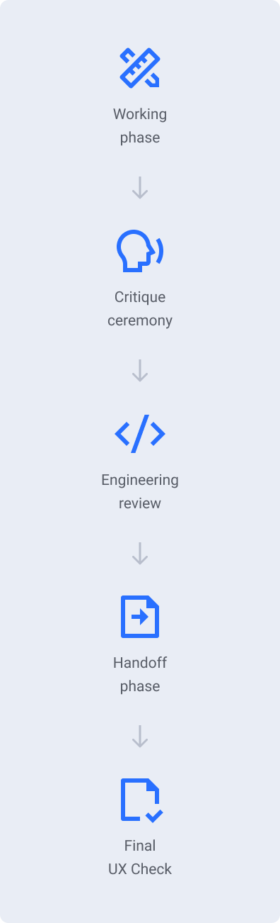
Working
Components were actively restructured by the responsible designer and prepared for internal review.
Critique
Once considered ready, components were presented in a formal critique session. Feedback from other product designers often surfaced additional requirements, which were incorporated before moving forward.
Engineering review
Before handoff, developers reviewed structure and feasibility. Trade offs were discussed collaboratively, balancing implementation effort, scalability, and avoidance of unnecessary complexity.
Handoff
A detailed documentation file was created outlining usage, anatomy, tokens, variations, behaviors, and responsiveness to ensure accurate implementation.
UX Check
After development and before publication, the implemented component was reviewed against the design specification. Publication occurred only after full alignment was confirmed.
Outcomes
The Migration Plan brought significant improvements to the Celebration Design System, successfully consolidating the parallel libraries into a single, shared system and establishing a true single source of truth. Key outcomes include:
70+
Components refactored
All existing Angular and React components were refactored, aligning both frameworks and reducing implementation discrepancies.
92.5%
Component enhancement
37 existing components were redesigned and enhanced, covering around 92.5% of the system’s active components. Updates included visual refinements, behavior adjustments, and performance optimizations.
35%
Coverage expansion
14 new components were added, expanding coverage by roughly 35%.
60+
Design Tokens evolution
Tokens were strengthened across spacing, sizing, and borders, reinforcing consistency across all products.
100%
Accessibility integration
Contrast, focus management, and navigation hierarchy were improved, raising overall compliance with accessibility best practices.
50+
Components impacted
Celebration shifted from a fragmented ecosystem into a unified platform accelerating adoption and reducing structural inefficiencies.
Company impact
This initiative went beyond a technical reorganization of the Design System. It marked a significant transformation for the company.
Key impacts include:
Consistency
Users now experience greater interface coherence across products.
Efficiency
Teams now rely on a unified foundation, reducing duplication and rework.
Adoption growth
Celebration adoption increased by 57%, reestablishing it as the company’s default Design System standard across teams.
Cost avoidance
Reducing redundant design and engineering efforts lowered indirect operational waste.
Collaboration
Cross functional coordination strengthened alignment between Design Ops, product design, and engineering.
Sustainability
With more mature tokens, refactored components, and accessibility best practices incorporated, the Design System is now a scalable platform ready to support future growth and evolution.
BONUS
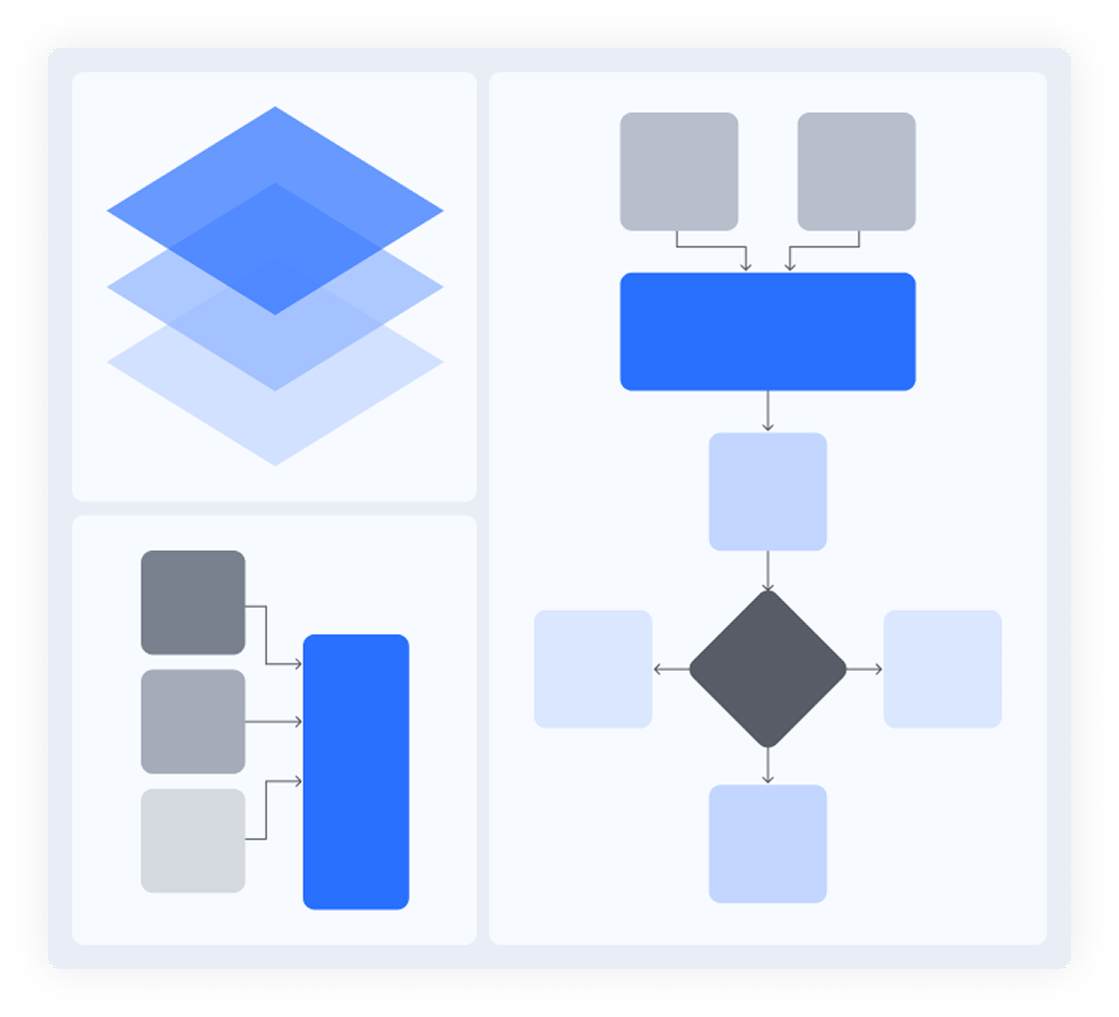
Architecture decisions behind the system evolution
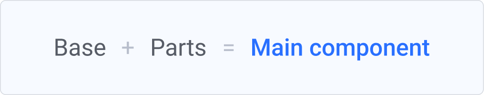
The component architecture followed a Building Blocks approach inspired by Atomic Design principles to ensure scalability without increasing complexity.
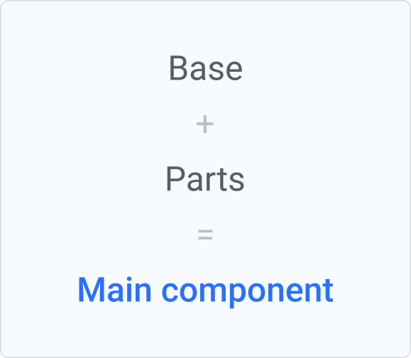
Each component was structured around three layers:
Parts
Nested components that compose the Base. They may contain internal variants and configurable properties. They support variations such as quantity adjustments and conditional visibility, enabling adaptable compositions while preserving structural integrity. Like the Base, Parts remain hidden from the published library.
Base
Represents the parent structure that supports all variants. It defines layout rules and interaction states while centralizing shared logic. This ensures behavioral and structural consistency across variations and prevents fragmentation over time. The Base component remains hidden and is not directly consumed by product teams.
Main component
The Main Component is the only published layer available for product teams. Built on top of the Base and Parts, it exposes a simplified set of properties for consumption. This separation reduces misuse, streamlines decision making, and safeguards the system’s internal architecture while maintaining flexibility at scale.
In practice
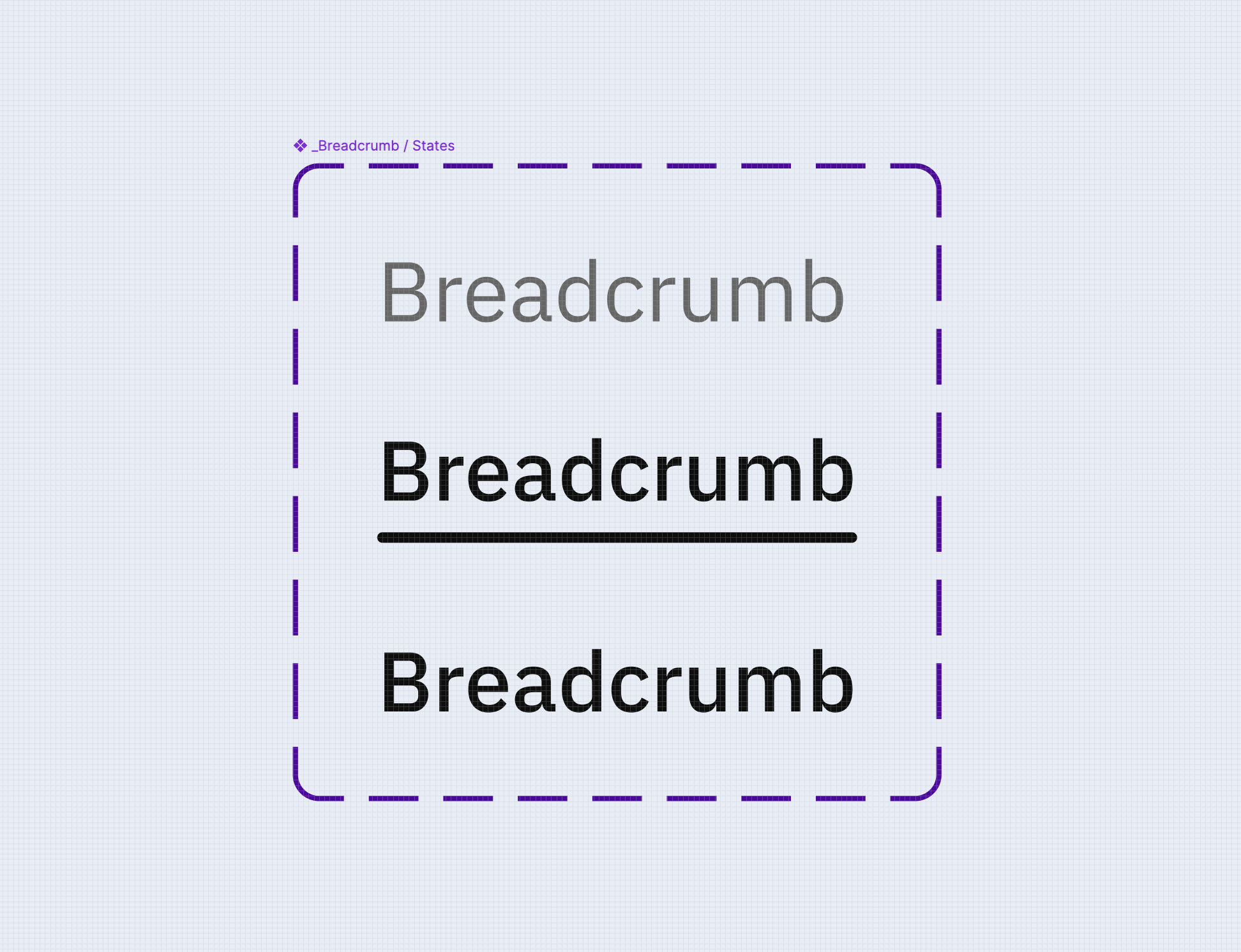
Naming strategy
Naming followed Figma’s hierarchical model to clearly separate internal architecture from the published library.
Property conventions were standardized across size, type, state, status, and quantity to reduce ambiguity and reinforce predictable usage patterns.
This architectural approach strengthened governance while preserving flexibility, enabling the system to scale without fragmenting.
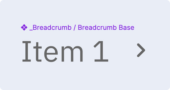
Parts
_{Component} / {Part}
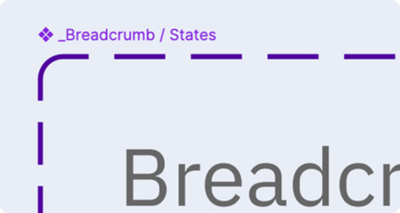
Base
_{Component} / {Component} Base
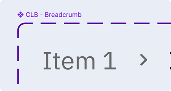
Main component
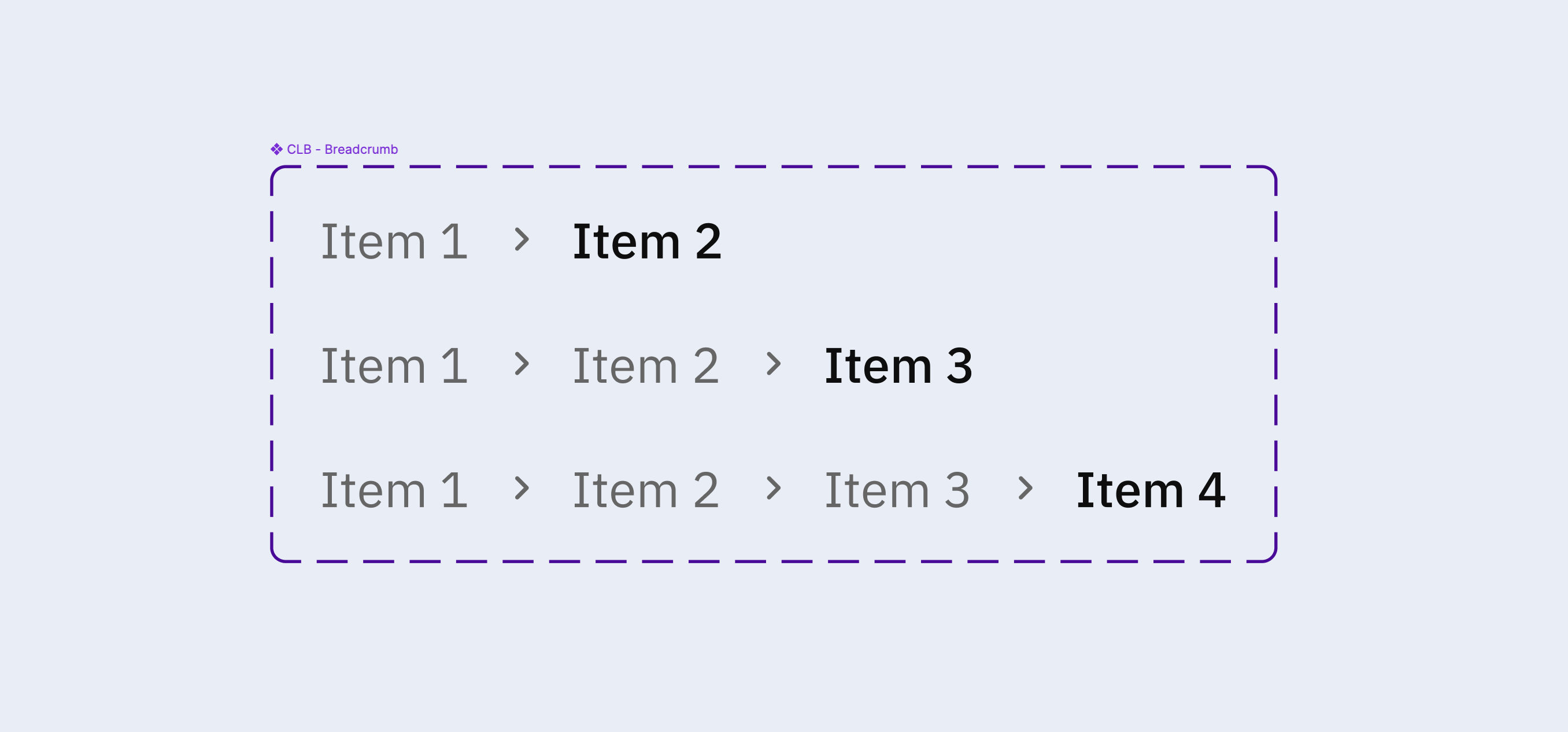
CLB-{Component}
Property conventions
Size
Follows a T shirt model combined with the component height to increase precision.
SM [32], MD [40], LG [48]
Type
Defines the stylistic variation of the component.
Ghost, Filled, Shape
States
Represent interaction feedback.
Default, Hover, Focus, Disabled, Error
Status
Communicates semantic meaning.
Positive, Warning, Error, Neutral, Info
Quantity
is used when a component supports repeated elements.
1, 2, 3, 4, 5 (Such as a list with 4 items)


Mariana Azambuja
About
Contact


Evolving a Design System
into a global standard
Context
The Migration Plan was a strategic initiative I led as part of Ambev Tech’s Design Ops team to consolidate parallel component libraries into the Celebration Design System.
As products evolved, teams began creating independent libraries to meet immediate needs. While this preserved delivery speed, it gradually introduced inconsistencies and weakened the system’s role as a single source of truth.
More than simply consolidating libraries, the plan aimed to create a sustainable ecosystem where components, tokens, and shared practices could be maintained and evolved in a structured way across teams. It marked an important step in the evolution of the Design System, improving development efficiency, creating a better experience for designers and engineers, and bringing greater coherence to the company’s digital products.
Company
Ambev Tech
Role
Project Lead
Team
4 Designers
3 Developers
Timeline
Jan. to Sep. 2025
Tool
Figma
Key challenges
- Integrate two active parallel libraries without disrupting product delivery;
- Eliminate duplication while maintaining delivery speed;
- Making sure product teams’ needs continued to be met during the migration;
- Removing friction and bottlenecks while merging the libraries;
- Balance immediate product demands with long term system health.
Main goals
- Consolidate parallel component libraries into a single shared Design System;
- Increase organizational efficiency by reducing redundant design and engineering efforts;
- Restore consistency across products;
- Preserve product specific needs while merging libraries;
- Strengthen Celebration as the company’s global standard.
My role
I defined the overall direction and operating model in collaboration with three designers. I structured the migration strategy, clarified decision making flows, and ensured alignment from architectural decisions to final delivery.
Beyond leading the initiative, I remained hands on throughout the process. I reviewed and refined components, aligned patterns across libraries, and ensured that every published element met a consistent quality and architectural standard.
This role required navigating technical trade offs, product priorities, and cross functional alignment to reposition the Design System from a reactive support layer into a strategic platform.
Project
System audit and discovery
The project began with the identification of two active parallel libraries used by some of the company’s most strategic products.
I facilitated working sessions with the designers responsible for each library to understand the motivations behind their creation, the product needs they addressed, and the perceived limitations of Celebration at that time.
This phase ensured the migration was grounded in real product requirements rather than treated as a simple consolidation effort. The objective was to preserve valuable learnings while strengthening the system as a whole.
Analysis and mapping
I led a deep analysis of both libraries to uncover overlaps, gaps, and architectural inconsistencies.
We identified which components could be incorporated as they were, which required refinement, and where new components were necessary. In parallel, I evaluated the impact on design tokens to strengthen the system’s foundational layer and support long term scalability.
This mapping phase directly informed prioritization and sequencing decisions.
Comparative component analysis: Button Icon across Celebration and parallel libs.
Process organization
Based on the insights gathered in the previous phase, I defined a structured migration plan to bring clarity and predictability to the process. I established priorities, organized the work into clear phases, and collaborated with the other designers to distribute responsibilities across the team.
We also aligned on a shared working model, defining how files would be structured and maintained. The goal was to ensure consistency, visibility into the status of each component, and a scalable workflow capable of supporting parallel contributions without losing coherence.
Refactoring incorporated new variables, properties, and behaviors from the parallel libraries to avoid losing relevant product insights. In parallel, design tokens were strengthened and accessibility improvements were embedded across components, ensuring holistic system evolution.
Component prioritization followed four criteria:
First
Foundational components such as buttons and inputs were refactored early. These elements act as building blocks across products, so stabilizing them ensured structural consistency at scale;
Second
High impact components already widely used within Celebration were prioritized to generate immediate value across teams;
Third
Remaining existing components were aligned with updated architectural standards and token structure to ensure cohesive system evolution;
Fourth
Components created within the parallel libraries and not yet present in Celebration were integrated. Each was evaluated for broader applicability and adjusted when necessary to serve multiple products rather than a single context.
Process flow
Execution phase
The migration execution followed five structured phases applied after components had been analyzed, prioritized, and assigned. These phases guided the hands on work of refactoring and integration, ensuring consistency and quality during implementation.
The workflow included Working, Critique, Engineering review, Handoff, and UX Check
Throughout this stage, I facilitated weekly alignment sessions to maintain transparency, surface risks early, and ensure internal peer evaluation before broader exposure to the organization.
A component was only published and made available in the library after successfully passing this review. The definition of done was achieved only when the component successfully progressed through all five phases.
Working
Components were actively restructured by the responsible designer and prepared for internal review.
Critique
Once considered ready, components were presented in a formal critique session. Feedback from other product designers often surfaced additional requirements, which were incorporated before moving forward.
Engineering review
Before handoff, developers reviewed structure and feasibility. Trade offs were discussed collaboratively, balancing implementation effort, scalability, and avoidance of unnecessary complexity.
Handoff
A detailed documentation file was created outlining usage, anatomy, tokens, variations, behaviors, and responsiveness to ensure accurate implementation.
UX Check
After development and before publication, the implemented component was reviewed against the design specification. Publication occurred only after full alignment was confirmed.
Outcomes
The Migration Plan brought significant improvements to the Celebration Design System, successfully consolidating the parallel libraries into a single, shared system and establishing a true single source of truth. Key outcomes include:
70+
Components refactored
All existing Angular and React components were refactored, aligning both frameworks and reducing implementation discrepancies.
92.5%
Component enhancement
37 existing components were redesigned and enhanced, covering around 92.5% of the system’s active components. Updates included visual refinements, behavior adjustments, and performance optimizations.
35%
Coverage expansion
14 new components were added, expanding coverage by roughly 35%.
60+
Design Tokens evolution
Tokens were strengthened across spacing, sizing, and borders, reinforcing consistency across all products.
100%
Accessibility integration
Contrast, focus management, and navigation hierarchy were improved, raising overall compliance with accessibility best practices.
50+
Components impacted
Celebration shifted from a fragmented ecosystem into a unified platform accelerating adoption and reducing structural inefficiencies.
Company impact
This initiative went beyond a technical reorganization of the Design System. It marked a significant transformation for the company.
Key impacts include:
Consistency
Users now experience greater interface coherence across products.
Efficiency
Teams now rely on a unified foundation, reducing duplication and rework.
Adoption growth
Celebration adoption increased by 57%, reestablishing it as the company’s default Design System standard across teams.
Cost avoidance
Reducing redundant design and engineering efforts lowered indirect operational waste.
Collaboration
Cross functional coordination strengthened alignment between Design Ops, product design, and engineering.
Sustainability
With more mature tokens, refactored components, and accessibility best practices incorporated, the Design System is now a scalable platform ready to support future growth and evolution.
BONUS
Architecture decisions behind the system evolution
The component architecture followed a Building Blocks approach inspired by Atomic Design principles to ensure scalability without increasing complexity.
Each component was structured around three layers:
Parts
Nested components that compose the Base. They may contain internal variants and configurable properties. They support variations such as quantity adjustments and conditional visibility, enabling adaptable compositions while preserving structural integrity. Like the Base, Parts remain hidden from the published library.
Base
Represents the parent structure that supports all variants. It defines layout rules and interaction states while centralizing shared logic. This ensures behavioral and structural consistency across variations and prevents fragmentation over time. The Base component remains hidden and is not directly consumed by product teams.
Main component
The Main Component is the only published layer available for product teams. Built on top of the Base and Parts, it exposes a simplified set of properties for consumption. This separation reduces misuse, streamlines decision making, and safeguards the system’s internal architecture while maintaining flexibility at scale.
In practice
Naming strategy
Naming followed Figma’s hierarchical model to clearly separate internal architecture from the published library.
Property conventions were standardized across size, type, state, status, and quantity to reduce ambiguity and reinforce predictable usage patterns.
This architectural approach strengthened governance while preserving flexibility, enabling the system to scale without fragmenting.
Parts
_{Component} / {Part}
Base
_{Component} / {Component} Base
Main component
CLB-{Component}
Property conventions
Size
Follows a T shirt model combined with the component height to increase precision.
SM [32], MD [40], LG [48]
Type
Defines the stylistic variation of the component.
Ghost, Filled, Shape
States
Represent interaction feedback.
Default, Hover, Focus, Disabled, Error
Status
Communicates semantic meaning.
Positive, Warning, Error, Neutral, Info
Quantity
is used when a component supports repeated elements.
1, 2, 3, 4, 5 (Such as a list with 4 items)
Mariana Azambuja
Happy you explored my work!


masazambuja@gmail.com
Mariana Azambuja
About
Contact
Evolving a Design System
into a global standard
Context
The Migration Plan was a strategic initiative I led as part of Ambev Tech’s Design Ops team to consolidate parallel component libraries into the Celebration Design System.
As products evolved, teams began creating independent libraries to meet immediate needs. While this preserved delivery speed, it gradually introduced inconsistencies and weakened the system’s role as a single source of truth.
More than simply consolidating libraries, the plan aimed to create a sustainable ecosystem where components, tokens, and shared practices could be maintained and evolved in a structured way across teams. It marked an important step in the evolution of the Design System, improving development efficiency, creating a better experience for designers and engineers, and bringing greater coherence to the company’s digital products.
Company
Ambev Tech
Role
Project Lead
Team
4 Designers
3 Developers
Timeline
Jan. to Sep. 2025
Tool
Figma
Key challenges
- Integrate two active parallel libraries without disrupting product delivery;
- Eliminate duplication while maintaining delivery speed;
- Making sure product teams’ needs continued to be met during the migration;
- Removing friction and bottlenecks while merging the libraries;
- Balance immediate product demands with long term system health.
Main goals
- Consolidate parallel component libraries into a single shared Design System;
- Increase organizational efficiency by reducing redundant design and engineering efforts;
- Restore consistency across products;
- Preserve product specific needs while merging libraries;
- Strengthen Celebration as the company’s global standard.
My role
I defined the overall direction and operating model in collaboration with three designers. I structured the migration strategy, clarified decision making flows, and ensured alignment from architectural decisions to final delivery.
Beyond leading the initiative, I remained hands on throughout the process. I reviewed and refined components, aligned patterns across libraries, and ensured that every published element met a consistent quality and architectural standard.
This role required navigating technical trade offs, product priorities, and cross functional alignment to reposition the Design System from a reactive support layer into a strategic platform.
Project
System audit and discovery
The project began with the identification of two active parallel libraries used by some of the company’s most strategic products.
I facilitated working sessions with the designers responsible for each library to understand the motivations behind their creation, the product needs they addressed, and the perceived limitations of Celebration at that time.
This phase ensured the migration was grounded in real product requirements rather than treated as a simple consolidation effort. The objective was to preserve valuable learnings while strengthening the system as a whole.
Analysis and mapping
I led a deep analysis of both libraries to uncover overlaps, gaps, and architectural inconsistencies.
We identified which components could be incorporated as they were, which required refinement, and where new components were necessary. In parallel, I evaluated the impact on design tokens to strengthen the system’s foundational layer and support long term scalability.
This mapping phase directly informed prioritization and sequencing decisions.
Comparative component analysis: Button Icon across Celebration and parallel libs.
Process organization
Based on the insights gathered in the previous phase, I defined a structured migration plan to bring clarity and predictability to the process. I established priorities, organized the work into clear phases, and collaborated with the other designers to distribute responsibilities across the team.
We also aligned on a shared working model, defining how files would be structured and maintained. The goal was to ensure consistency, visibility into
the status of each component, and a scalable workflow capable of supporting parallel contributions without losing coherence.
Refactoring incorporated new variables, properties, and behaviors from the parallel libraries to avoid losing relevant product insights.
In parallel, design tokens were strengthened and accessibility improvements were embedded across components, ensuring holistic system evolution.
Component prioritization followed four criteria:
First
Foundational components such as buttons and inputs were refactored early. These elements act as building blocks across products, so stabilizing them ensured structural consistency at scale;
Second
High impact components already widely used within Celebration were prioritized to generate immediate value across teams;
Third
Remaining existing components were aligned with updated architectural standards and token structure to ensure cohesive system evolution;
Fourth
Components created within the parallel libraries and not yet present in Celebration were integrated. Each was evaluated for broader applicability and adjusted when necessary to serve multiple products rather than a single context.
Process flow
Execution phase
The migration execution followed five structured phases applied after components had been analyzed, prioritized, and assigned. These phases guided the hands on work of refactoring and integration, ensuring consistency and quality during implementation.
The workflow included Working, Critique, Engineering review, Handoff, and UX Check.
Throughout this stage, I facilitated weekly alignment sessions to maintain transparency, surface risks early, and ensure internal peer evaluation before broader exposure to the organization.
A component was only published and made available in the library after successfully passing this review.
The definition of done was achieved only when the component successfully progressed through all five phases.
Working
Components were actively restructured by the responsible designer and prepared for internal review.
Critique
Once considered ready, components were presented in a formal critique session. Feedback from other product designers often surfaced additional requirements, which were incorporated before moving forward.
Engineering review
Before handoff, developers reviewed structure and feasibility. Trade offs were discussed collaboratively, balancing implementation effort, scalability, and avoidance of unnecessary complexity.
Handoff
A detailed documentation file was created outlining usage, anatomy, tokens, variations, behaviors, and responsiveness to ensure accurate implementation.
UX Check
After development and before publication, the implemented component was reviewed against the design specification. Publication occurred only after full alignment was confirmed.
Outcomes
The Migration Plan brought significant improvements to the Celebration Design System, successfully consolidating the parallel libraries into a single, shared system and establishing a true single source of truth. Key outcomes include:
70+
Components refactored
All existing Angular and React components were refactored, aligning both frameworks and reducing implementation discrepancies.
92.5%
Component enhancement
37 existing components were redesigned and enhanced, covering around 92.5% of the system’s active components. Updates included visual refinements, behavior adjustments, and performance optimizations.
35%
Coverage expansion
14 new components were added, expanding coverage by roughly 35%.
60+
Design Tokens evolution
Tokens were strengthened across spacing, sizing, and borders, reinforcing consistency across all products.
100%
Accessibility integration
Contrast, focus management, and navigation hierarchy were improved, raising overall compliance with accessibility best practices.
50+
Components impacted
Celebration shifted from a fragmented ecosystem into a unified platform accelerating adoption and reducing structural inefficiencies.
Company impact
This initiative went beyond a technical reorganization of the Design System. It marked a significant transformation for the company.
Key impacts include:
Consistency
Users now experience greater interface coherence across products.
Efficiency
Teams now rely on a unified foundation, reducing duplication and rework.
Adoption growth
Celebration adoption increased by 57%, reestablishing it as the company’s default Design System standard across teams.
Cost avoidance
Reducing redundant design and engineering efforts lowered indirect operational waste.
Collaboration
Cross functional coordination strengthened alignment between Design Ops, product design, and engineering.
Sustainability
With more mature tokens, refactored components, and accessibility best practices incorporated, the Design System is now a scalable platform ready to support future growth and evolution.
BONUS
Architecture decisions behind the system evolution
The component architecture followed a Building Blocks approach inspired by Atomic Design principles to ensure scalability without increasing complexity.
Each component was structured around three layers:
Parts
Nested components that compose the Base. They may contain internal variants and configurable properties. They support variations such as quantity adjustments and conditional visibility, enabling adaptable compositions while preserving structural integrity. Like the Base, Parts remain hidden from the published library.
Base
Represents the parent structure that supports all variants. It defines layout rules and interaction states while centralizing shared logic. This ensures behavioral and structural consistency across variations and prevents fragmentation over time. The Base component remains hidden and is not directly consumed by product teams.
Main component
The Main Component is the only published layer available for product teams. Built on top of the Base and Parts, it exposes a set of properties for consumption. This separation reduces misuse, streamlines decision making, and safeguards the system’s internal architecture while maintaining flexibility at scale.
In practice
Naming strategy
Naming followed Figma’s hierarchical model to clearly separate internal architecture from the published library.
Property conventions were standardized across size, type, state, status, and quantity to reduce ambiguity and reinforce predictable usage patterns.
This architectural approach strengthened governance while preserving flexibility, enabling the system to scale without fragmenting.
Parts
_{Component} / {Part}
Base
_{Component} / {Component} Base
Main component
CLB-{Component}
Property conventions
Size
Follows a T shirt model combined with the component height to increase precision.
SM [32], MD [40], LG [48]
Type
Defines the stylistic variation of the component.
Ghost, Filled, Shape
States
Represent interaction feedback.
Default, Hover, Focus, Disabled, Error
Status
Communicates semantic meaning.
Positive, Warning, Error, Neutral, Info
Quantity
is used when a component supports repeated elements.
1, 2, 3, 4, 5 (Such as a list with 4 items)
Mariana Azambuja
Happy you explored my work!
masazambuja@gmail.com
Evolving a Design System
into a global standard
Context
The Migration Plan was a strategic initiative I led as part of Ambev Tech’s Design Ops team to consolidate parallel component libraries into the Celebration Design System.
As products evolved, teams began creating independent libraries to meet immediate needs. While this preserved delivery speed, it gradually introduced inconsistencies and weakened the system’s role as a single source of truth.
More than simply consolidating libraries, the plan aimed to create a sustainable ecosystem where components, tokens, and shared practices could be maintained and evolved in a structured way across teams. It marked an important step in the evolution of the Design System, improving development efficiency, creating a better experience for designers and engineers, and bringing greater coherence to the company’s digital products.
Company
Ambev Tech
Role
Project Lead
Team
4 Designers
3 Developers
Timeline
Jan. to Sep. 2025
Tool
Figma
Key challenges
- Integrate two active parallel libraries without disrupting product delivery;
- Eliminate duplication while maintaining delivery speed;
- Making sure product teams’ needs continued to be met during the migration;
- Removing friction and bottlenecks while merging the libraries;
- Balance immediate product demands with long term system health.
Main goals
- Consolidate parallel component libraries into a single shared Design System;
- Increase organizational efficiency by reducing redundant design and engineering efforts;
- Restore consistency across products;
- Preserve product specific needs while merging libraries;
- Strengthen Celebration as the company’s global standard.
My role
I defined the overall direction and operating model in collaboration with three designers. I structured the migration strategy, clarified decision making flows, and ensured alignment from architectural decisions to final delivery.
Beyond leading the initiative, I remained hands on throughout the process. I reviewed and refined components, aligned patterns across libraries, and ensured that every published element met a consistent quality and architectural standard.
This role required navigating technical trade offs, product priorities, and cross functional alignment to reposition the Design System from a reactive support layer into a strategic platform.
Project
System audit and discovery
The project began with the identification of two active parallel libraries used by some of the company’s most strategic products.
I facilitated working sessions with the designers responsible for each library to understand the motivations behind their creation, the product needs they addressed, and the perceived limitations of Celebration at that time.
This phase ensured the migration was grounded in real product requirements rather than treated as a simple consolidation effort. The objective was to preserve valuable learnings while strengthening the system as a whole.
Analysis and mapping
I led a deep analysis of both libraries to uncover overlaps, gaps, and architectural inconsistencies.
We identified which components could be incorporated as they were, which required refinement, and where new components were necessary. In parallel, I evaluated the impact on design tokens to strengthen the system’s foundational layer and support long term scalability.
This mapping phase directly informed prioritization and sequencing decisions.
Comparative component analysis: Button Icon across Celebration and parallel libs.
Process organization
Based on the insights gathered in the previous phase, I defined a structured migration plan to bring clarity and predictability to the process. I established priorities, organized the work into clear phases, and collaborated with the other designers to distribute responsibilities across the team.
We also aligned on a shared working model, defining how files would be structured and maintained. The goal was to ensure consistency, visibility into
the status of each component, and a scalable workflow capable of supporting parallel contributions without losing coherence.
Refactoring incorporated new variables, properties, and behaviors from the parallel libraries to avoid losing relevant product insights.
In parallel, design tokens were strengthened and accessibility improvements were embedded across components, ensuring holistic system evolution.
Component prioritization followed four criteria:
First
Foundational components such as buttons and inputs were refactored early. These elements act as building blocks across products, so stabilizing them ensured structural consistency at scale;
Second
High impact components already widely used within Celebration were prioritized to generate immediate value across teams;
Third
Remaining existing components were aligned with updated architectural standards and token structure to ensure cohesive system evolution;
Fourth
Components created within the parallel libraries and not yet present in Celebration were integrated. Each was evaluated for broader applicability and adjusted when necessary to serve multiple products rather than a single context.
Process flow
Execution phase
The migration execution followed five structured phases applied after components had been analyzed, prioritized, and assigned. These phases guided the hands on work of refactoring and integration, ensuring consistency and quality during implementation.
The workflow included Working, Critique, Engineering review, Handoff, and UX Check.
Throughout this stage, I facilitated weekly alignment sessions to maintain transparency, surface risks early, and ensure internal peer evaluation before broader exposure to the organization.
A component was only published and made available in the library after successfully passing this review.
The definition of done was achieved only when the component successfully progressed through all five phases.
Working
Components were actively restructured by the responsible designer and prepared for internal review.
Critique
Once considered ready, components were presented in a formal critique session. Feedback from other product designers often surfaced additional requirements, which were incorporated before moving forward.
Engineering review
Before handoff, developers reviewed structure and feasibility. Trade offs were discussed collaboratively, balancing implementation effort, scalability, and avoidance of unnecessary complexity.
Handoff
A detailed documentation file was created outlining usage, anatomy, tokens, variations, behaviors, and responsiveness to ensure accurate implementation.
UX Check
After development and before publication, the implemented component was reviewed against the design specification. Publication occurred only after full alignment was confirmed.
Outcomes
The Migration Plan brought significant improvements to the Celebration Design System, successfully consolidating the parallel libraries into a single, shared system and establishing a true single source of truth. Key outcomes include:
70+
Components refactored
All existing Angular and React components were refactored, aligning both frameworks and reducing implementation discrepancies.
92.5%
Component enhancement
37 existing components were redesigned and enhanced, covering around 92.5% of the system’s active components. Updates included visual refinements, behavior adjustments, and performance optimizations.
35%
Coverage expansion
14 new components were added, expanding coverage by roughly 35%.
60+
Design Tokens evolution
Tokens were strengthened across spacing, sizing, and borders, reinforcing consistency across all products.
100%
Accessibility integration
Contrast, focus management, and navigation hierarchy were improved, raising overall compliance with accessibility best practices.
50+
Components impacted
Celebration shifted from a fragmented ecosystem into a unified platform accelerating adoption and reducing structural inefficiencies.
Company impact
This initiative went beyond a technical reorganization of the Design System. It marked a significant transformation for the company.
Key impacts include:
Consistency
Users now experience greater interface coherence across products.
Efficiency
Teams now rely on a unified foundation, reducing duplication and rework.
Adoption growth
Celebration adoption increased by 57%, reestablishing it as the company’s default Design System standard across teams.
Cost avoidance
Reducing redundant design and engineering efforts lowered indirect operational waste.
Collaboration
Cross functional coordination strengthened alignment between Design Ops, product design, and engineering.
Sustainability
With more mature tokens, refactored components, and accessibility best practices incorporated, the Design System is now a scalable platform ready to support future growth and evolution.
BONUS
Architecture decisions behind the system evolution
The component architecture followed a Building Blocks approach inspired by Atomic Design principles to ensure scalability without increasing complexity.
Each component was structured around three layers:
Parts
Nested components that compose the Base. They may contain internal variants and configurable properties. They support variations such as quantity adjustments and conditional visibility, enabling adaptable compositions while preserving structural integrity. Like the Base, Parts remain hidden from the published library.
Base
Represents the parent structure that supports all variants. It defines layout rules and interaction states while centralizing shared logic. This ensures behavioral and structural consistency across variations and prevents fragmentation over time. The Base component remains hidden and is not directly consumed by product teams.
Main component
The Main Component is the only published layer available for product teams. Built on top of the Base and Parts, it exposes a simplified set of properties for consumption. This separation reduces misuse, streamlines decision making, and safeguards the system’s internal architecture while maintaining flexibility at scale.
In practice
Naming strategy
Naming followed Figma’s hierarchical model to clearly separate internal architecture from the published library.
Property conventions were standardized across size, type, state, status, and quantity to reduce ambiguity and reinforce predictable usage patterns.
This architectural approach strengthened governance while preserving flexibility, enabling the system to scale without fragmenting.
Parts
_{Component} / {Part}
Base
_{Component} / {Component} Base
Main component
CLB-{Component}
Property conventions
Size
Follows a T shirt model combined with the component height to increase precision.
SM [32], MD [40], LG [48]
Type
Defines the stylistic variation of the component.
Ghost, Filled, Shape
States
Represent interaction feedback.
Default, Hover, Focus, Disabled, Error
Status
Communicates semantic meaning.
Positive, Warning, Error, Neutral, Info
Quantity
is used when a component supports repeated elements.
1, 2, 3, 4, 5 (Such as a list with 4 items)
Mariana Azambuja
Happy you explored my work!
masazambuja@gmail.com
Evolving a Design System
into a global standard
Context
The Migration Plan was a strategic initiative I led as part of Ambev Tech’s Design Ops team to consolidate parallel component libraries into the Celebration Design System.
As products evolved, teams began creating independent libraries to meet immediate needs. While this preserved delivery speed, it gradually introduced inconsistencies and weakened the system’s role as a single source of truth.
More than simply consolidating libraries, the plan aimed to create a sustainable ecosystem where components, tokens, and shared practices could be maintained and evolved in a structured way across teams. It marked an important step in the evolution of the Design System, improving development efficiency, creating a better experience for designers and engineers, and bringing greater coherence to the company’s digital products.
Company
Ambev Tech
Role
Project Lead
Team
4 Designers
3 Developers
Timeline
Jan. to Sep. 2025
Tool
Figma
Key challenges
- Integrate two active parallel libraries without disrupting product delivery;
- Eliminate duplication while maintaining delivery speed;
- Making sure product teams’ needs continued to be met during the migration;
- Removing friction and bottlenecks while merging the libraries;
- Balance immediate product demands with long term system health.
Main goals
- Consolidate parallel component libraries into a single shared Design System;
- Increase organizational efficiency by reducing redundant design and engineering efforts;
- Restore consistency across products;
- Preserve product specific needs while merging libraries;
- Strengthen Celebration as the company’s global standard.
My role
I defined the overall direction and operating model in collaboration with three designers. I structured the migration strategy, clarified decision making flows, and ensured alignment from architectural decisions to final delivery.
Beyond leading the initiative, I remained hands on throughout the process. I reviewed and refined components, aligned patterns across libraries, and ensured that every published element met a consistent quality and architectural standard.
This role required navigating technical trade offs, product priorities, and cross functional alignment to reposition the Design System from a reactive support layer into a strategic platform.
Project
System audit and discovery
The project began with the identification of two active parallel libraries used by some of the company’s most strategic products.
I facilitated working sessions with the designers responsible for each library to understand the motivations behind their creation, the product needs they addressed, and the perceived limitations of Celebration at that time.
This phase ensured the migration was grounded in real product requirements rather than treated as a simple consolidation effort. The objective was to preserve valuable learnings while strengthening the system as a whole.
Analysis and mapping
I led a deep analysis of both libraries to uncover overlaps, gaps, and architectural inconsistencies.
We identified which components could be incorporated as they were, which required refinement, and where new components were necessary. In parallel, I evaluated the impact on design tokens to strengthen the system’s foundational layer and support long term scalability.
This mapping phase directly informed prioritization and sequencing decisions.
Comparative component analysis: Button Icon across Celebration and parallel libs.
Process organization
Based on the insights gathered in the previous phase, I defined a structured migration plan to bring clarity and predictability to the process. I established priorities, organized the work into clear phases, and collaborated with the other designers to distribute responsibilities across the team.
We also aligned on a shared working model, defining how files would be structured and maintained. The goal was to ensure consistency, visibility into the status of each
component, and a scalable workflow capable of supporting parallel contributions without losing coherence.
Refactoring incorporated new variables, properties, and behaviors from the parallel libraries to avoid losing relevant product insights.
In parallel, design tokens were strengthened and accessibility improvements were embedded across components, ensuring holistic system evolution.
Component prioritization followed four criteria:
First
Foundational components such as buttons and inputs were refactored early. These elements act as building blocks across products, so stabilizing them ensured structural consistency at scale;
Second
High impact components already widely used within Celebration were prioritized to generate immediate value across teams;
Third
Remaining existing components were aligned with updated architectural standards and token structure to ensure cohesive system evolution;
Fourth
Components created within the parallel libraries and not yet present in Celebration were integrated. Each was evaluated for broader applicability and adjusted when necessary to serve multiple products rather than a single context.
Process flow
Execution phase
The migration execution followed five structured phases applied after components had been analyzed, prioritized, and assigned. These phases guided the hands on work of refactoring and integration, ensuring consistency and quality during implementation.
The workflow included Working, Critique, Engineering review, Handoff, and UX Check.
Throughout this stage, I facilitated weekly alignment sessions to maintain transparency, surface risks early, and ensure internal peer evaluation before broader exposure to the organization.
A component was only published and made available in the library after successfully passing this review.
The definition of done was achieved only when the component successfully progressed through all five phases.
Working
Components were actively restructured by the responsible designer and prepared for internal review.
Critique
Once considered ready, components were presented in a formal critique session. Feedback from other product designers often surfaced additional requirements, which were incorporated before moving forward.
Engineering review
Before handoff, developers reviewed structure and feasibility. Trade offs were discussed collaboratively, balancing implementation effort, scalability, and avoidance of unnecessary complexity.
Handoff
A detailed documentation file was created outlining usage, anatomy, tokens, variations, behaviors, and responsiveness to ensure accurate implementation.
UX Check
After development and before publication, the implemented component was reviewed against the design specification. Publication occurred only after full alignment was confirmed.
Outcomes
The Migration Plan brought significant improvements to the Celebration Design System, successfully consolidating the parallel libraries into a single, shared system and establishing a true single source of truth. Key outcomes include:
70+
Components refactored
All existing Angular and React components were refactored, aligning both frameworks and reducing implementation discrepancies.
92.5%
Component enhancement
37 existing components were redesigned and enhanced, covering around 92.5% of the system’s active components. Updates included visual refinements, behavior adjustments, and performance optimizations.
35%
Coverage expansion
14 new components were added, expanding coverage by roughly 35%.
60+
Design Tokens evolution
Tokens were strengthened across spacing, sizing, and borders, reinforcing consistency across all products.
100%
Accessibility integration
Contrast, focus management, and navigation hierarchy were improved, raising overall compliance with accessibility best practices.
50+
Components impacted
Celebration shifted from a fragmented ecosystem into a unified platform accelerating adoption and reducing structural inefficiencies.
Company impact
This initiative went beyond a technical reorganization of the Design System. It marked a significant transformation for the company.
Key impacts include:
Consistency
Users now experience greater interface coherence across products.
Efficiency
Teams now rely on a unified foundation, reducing duplication and rework.
Adoption growth
Celebration adoption increased by 57%, reestablishing it as the company’s default Design System standard across teams.
Cost avoidance
Reducing redundant design and engineering efforts lowered indirect operational waste.
Collaboration
Cross functional coordination strengthened alignment between Design Ops, product design, and engineering.
Sustainability
With more mature tokens, refactored components, and accessibility best practices incorporated, the Design System is now a scalable platform ready to support future growth and evolution.
BONUS
Architecture decisions behind the system evolution
The component architecture followed a Building Blocks approach inspired by Atomic Design principles to ensure scalability without increasing complexity.
Each component was structured around three layers:
Parts
Nested components that compose the Base. They may contain internal variants and configurable properties. They support variations such as quantity adjustments and conditional visibility, enabling adaptable compositions while preserving structural integrity. Like the Base, Parts remain hidden from the published library.
Base
Represents the parent structure that supports all variants. It defines layout rules and interaction states while centralizing shared logic. This ensures behavioral and structural consistency across variations and prevents fragmentation over time. The Base component remains hidden and is not directly consumed by product teams.
Main component
The Main Component is the only published layer available for product teams. Built on top of the Base and Parts, it exposes a simplified set of properties for consumption. This separation reduces misuse, streamlines decision making, and safeguards the system’s internal architecture while maintaining flexibility at scale.
In practice
Naming strategy
Naming followed Figma’s hierarchical model to clearly separate internal architecture from the published library.
Property conventions were standardized across size, type, state, status, and quantity to reduce ambiguity and reinforce predictable usage patterns.
This architectural approach strengthened governance while preserving flexibility, enabling the system to scale without fragmenting.
Parts
_{Component} / {Part}
Base
_{Component} / {Component} Base
Main component
CLB-{Component}
Property conventions
Size
Follows a T shirt model combined with the component height to increase precision.
SM [32], MD [40], LG [48]
Type
Defines the stylistic variation of the component.
Ghost, Filled, Shape
States
Represent interaction feedback.
Default, Hover, Focus, Disabled, Error
Status
Communicates semantic meaning.
Positive, Warning, Error, Neutral, Info
Quantity
is used when a component supports repeated elements.
1, 2, 3, 4, 5 (Such as a list with 4 items)
Mariana Azambuja
Happy you explored my work!
masazambuja@gmail.com