From palette
to system:
Rebuilding
color tokens
Context
Celebration is the Design System serving Ambev (Brazil) and AB InBev (global), created to drive consistency, scalability, and operational efficiency across internal digital products.
Since its launch in September 2021, it has expanded to support around 70 products, aligning design and engineering teams around shared standards, reusable components, and streamlined workflows. The system plays a key role in accelerating product delivery while maintaining quality and coherence at scale, with continued growth in adoption across the organization.
Company
Ambev Tech
Role
Design System Lead
Team
1 Designer
2 Developers
Timeline
November 2024
Tool
Figma
Project goal
This project focused on re-architecting Celebration’s color system to address structural limitations and enable long-term scalability. The objective was to establish a robust token foundation that could support accessibility standards, improve semantic clarity, and ensure consistent behavior across Light and Dark modes. By strengthening the color architecture, the initiative aimed to reduce complexity, enhance maintainability, and provide a flexible framework capable of sustaining the system’s continued growth across products and teams.
Key challenges
- Limited scalability of the existing palette;
- Weak semantic naming structure;
- Lack of cohesion between hues and tonal scales;
- Accessibility issues across color combinations;
- Multiple area-specific color themes (Logistics, Supply, etc.), increasing fragmentation and complexity;
- High maintenance overhead due to decentralized color governance.
Main goals
- Redesign the color system to support scalability and long-term evolution;
- Establish a cohesive and unified chromatic foundation across all products;
- Strengthen semantic structure to improve clarity, flexibility, and reusability;
- Ensure accessibility compliance across color combinations and use cases;
- Reduce complexity caused by department-specific themes;
- Enable easier adoption and governance within the Design System.
Process
Step 1
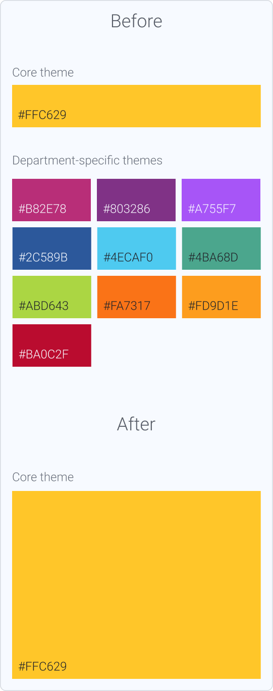
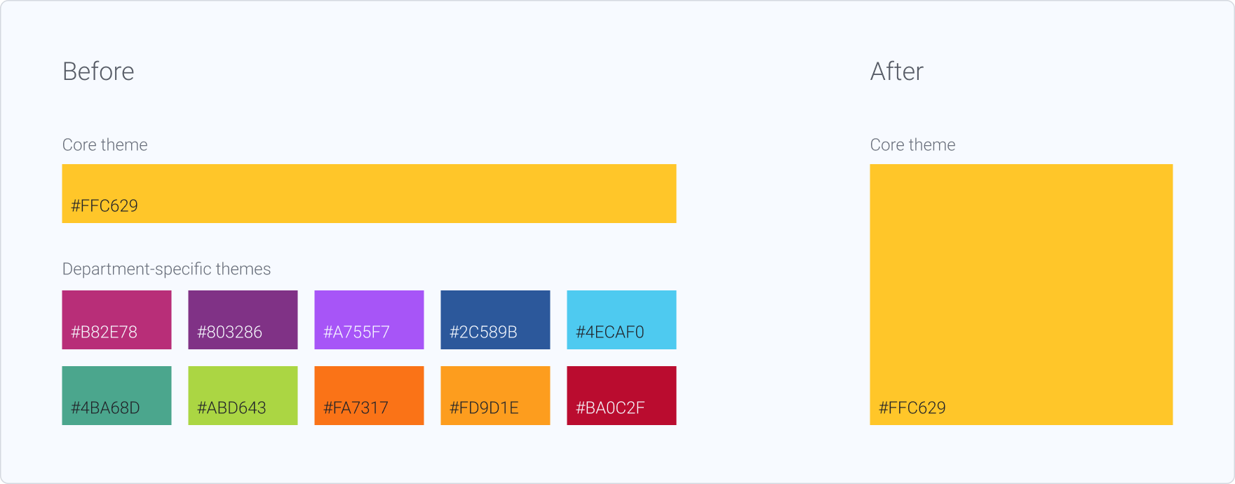
Before initiating the refactor, we defined a consolidation strategy: maintaining a single “Core” theme based on the company’s official brand colors. This decision eliminated the need to revise the remaining 11 department-specific themes and reduced structural complexity within the system.
Step 2
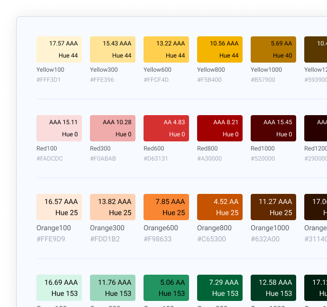
I began with a structured audit of the existing color tokens, analyzing their architecture, semantic structure, and scalability. The goal was to identify structural inconsistencies, accessibility gaps, and opportunities for refinement.
Key findings included:
- Color scales with limited tonal steps
- Irregular hue progression across tonal scales
- Color families without structured tonal ramps
- Low semantic specificity in token naming
- Lack of clearly defined accessibility guidelines
- Absence of secondary/supporting color families within the palette
Step 3
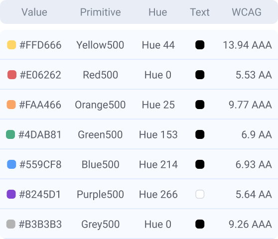
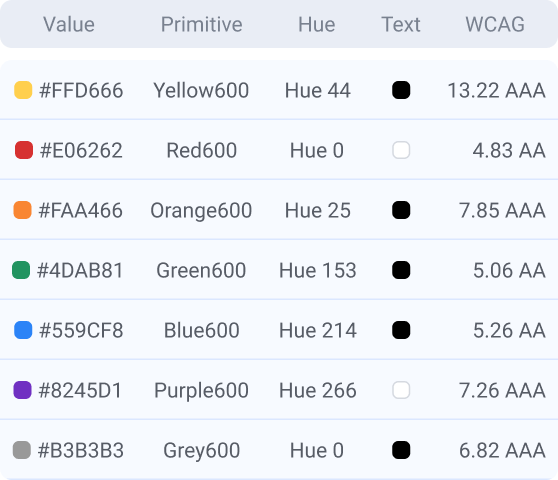
I began by auditing the existing color scales, mapping each hue to its corresponding semantic tokens and documenting their relationships across the system. This included a structured analysis of contrast variations, evaluating color-on-color and text-on-color combinations to assess consistency and accessibility compliance.
Step 4
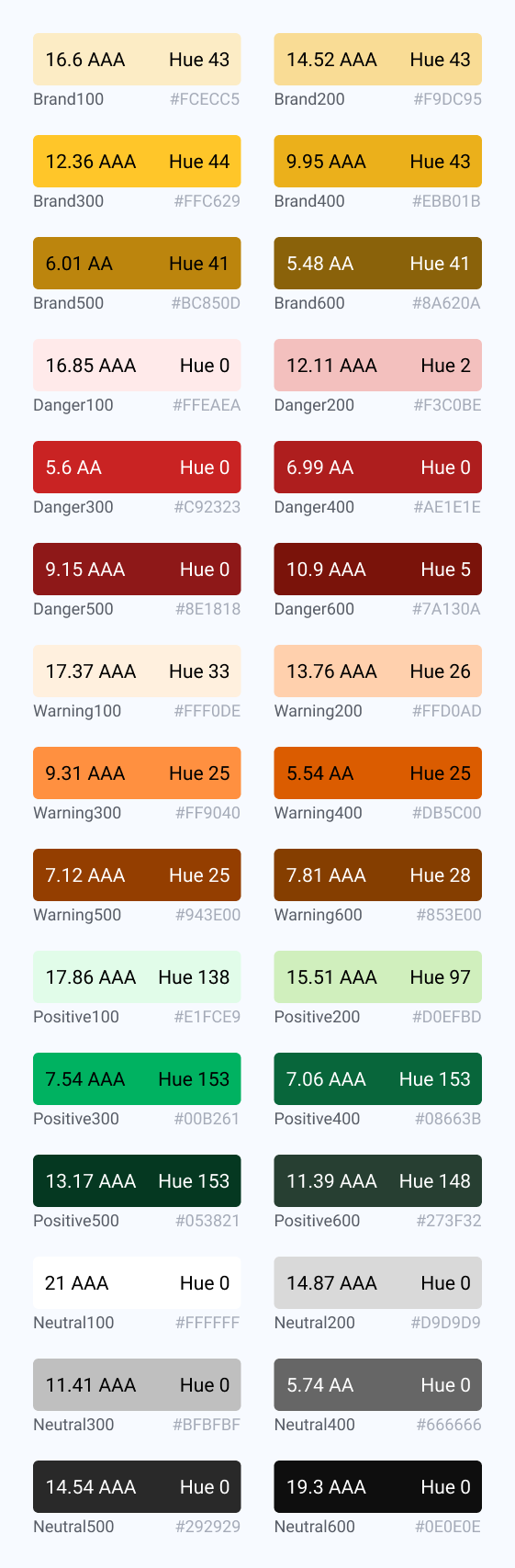
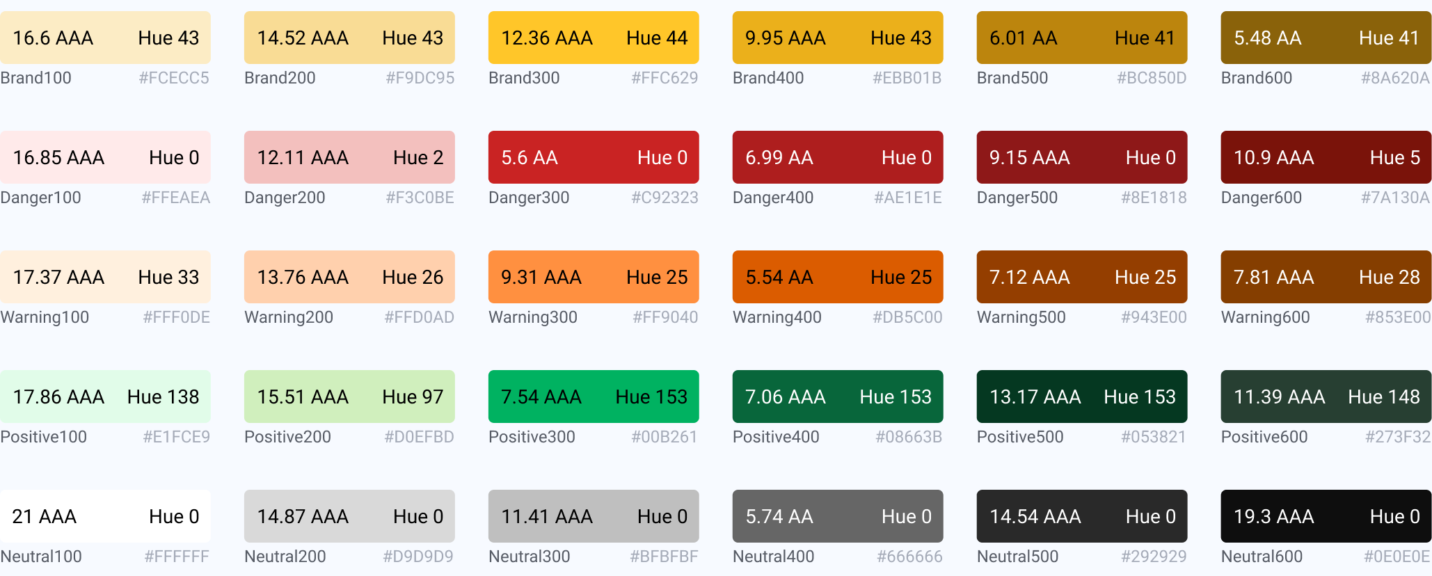
Following the audit, the next step was to redesign the color scales based on the identified structural gaps. New proposals were developed to ensure consistent hue progression, improved tonal regularity, and expanded tonal range across each color family.
The revised scales were constructed with accessibility criteria embedded from the outset, validating contrast performance across key use cases (text-on-color and color-on-color) and ensuring compliance with established standards.
This phase focused on creating more granular, predictable tonal ramps that could support diverse interface states while maintaining visual cohesion and scalability within the system.
View all tokens →
Step 5
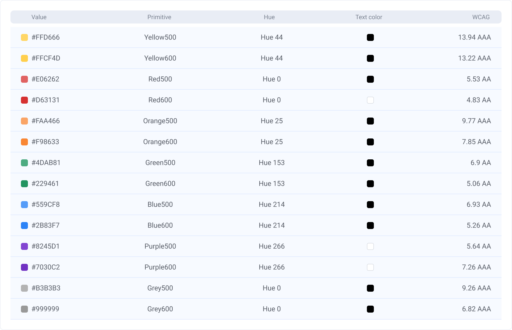
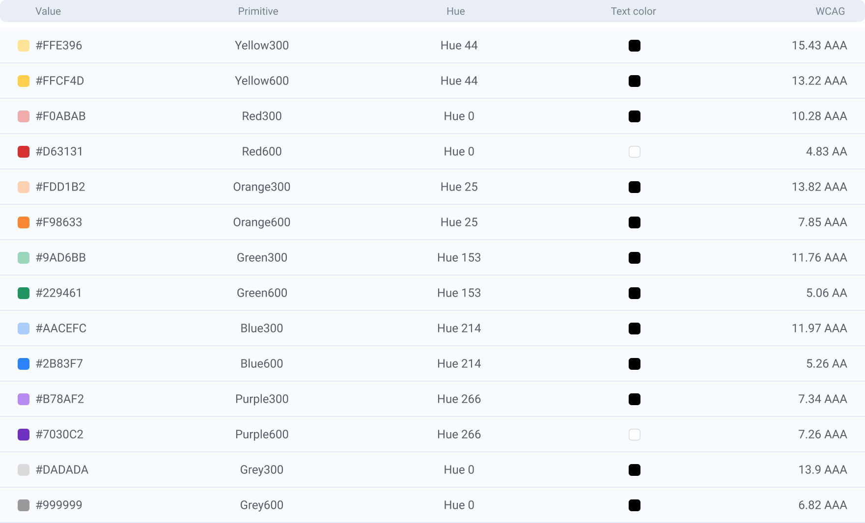
Once the scales were defined and structured, the next step was to determine which tonal steps would be activated in the initial design system implementation. Rather than exposing the entire range, a curated subset of intervals was selected to support core interface use cases (e.g., surfaces, text, borders, states), ensuring clarity and reducing unnecessary complexity.
The non-activated intervals remain intentionally preserved within the primitive layer. These unused steps play a strategic role in maintaining scalability, enabling future expansion, theming flexibility, and the introduction of new semantic tokens without requiring structural refactoring.
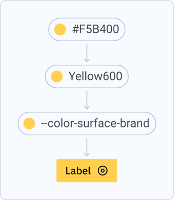
The tonal ramps themselves remain identical across Light and Dark modes. The distinction lies in how intervals are mapped at the semantic layer. For example, the surface token in Light mode corresponds to Gray50 (#F7F7F7), while its Dark mode counterpart maps to Gray1100 (#1A1A1A). This approach ensures consistency at the primitive level while enabling contextual adaptation through semantic reassignment.
View all tokens →
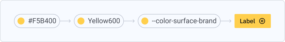
Step 6
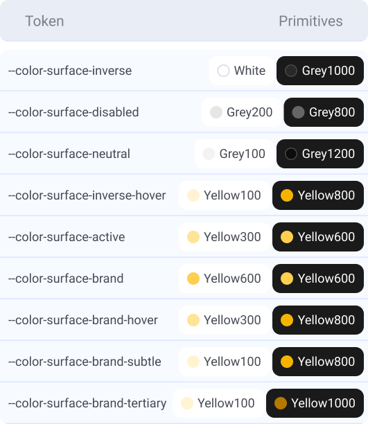
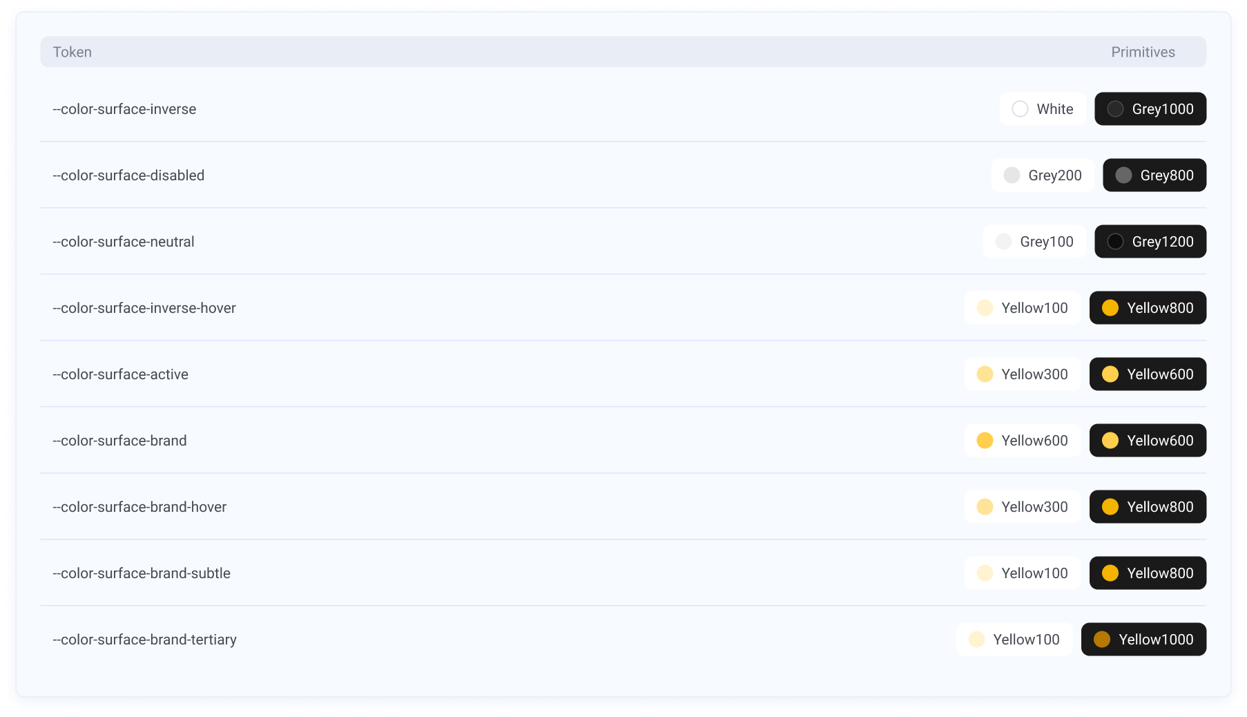
Following the audits, structural analysis, and usage mapping, the semantic token layer was defined to translate primitive values into functional application contexts.
Eight core usage categories were established, including surface, background, feedback, text (covering label and placeholder), border, and icon, each representing a distinct interaction and hierarchy role within the interface.
For every category, existing components and templates were systematically reviewed to identify real usage patterns, state variations, and contrast requirements. This ensured that semantic tokens were grounded in practical implementation needs rather than abstract definitions.
Tokens were structured to maintain parity between Light and Dark modes through mirrored semantic logic, allowing contextual adaptation without altering the underlying primitive scales.
View all tokens →
Handoff
A structured handoff was conducted to ensure accurate implementation of the new token architecture. Documentation detailed the full token hierarchy, including raw values (hex), primitive tokens, semantic mappings, and usage guidelines, enabling developers to clearly understand the relationship between layers and apply them consistently in code.
On the design side, a comprehensive variable structure was implemented in Figma, reflecting the same primitive-to-semantic architecture defined for development.
Results
- Expanded and restructured color palette, introducing two new base colors to increase expressive range;
- Improved accessibility standards across key color combinations and UI components;
- Increased system scalability through clearer tonal hierarchies and reusable structures;
- Established a unified chromatic framework adopted across multiple product areas;
- Enhanced semantic clarity, enabling more flexible and predictable application;
- Reduced fragmentation by consolidating previously department-specific themes.
Deliverables
- Re-architected color system with rebuilt tonal ramps, improved hue consistency, and expanded tonal range;
- Accessibility framework integrated into the token structure, including validated contrast pairs and documented compliance criteria;
- Structured token architecture with clear primitive–semantic separation and scalable naming logic;
- Light and Dark mode implementation;
- Handoff specification covering raw values, token hierarchy, and usage definitions;
- Figma variable system aligned with engineering token architecture;
- Refactored components and templates to ensure full system adoption;
- Comprehensive documentation supporting usage, hierarchy, and long-term governance;
- Coordinated rollout across supported products.


From palette to system:
Rebuilding color tokens
Context
Celebration is the Design System serving Ambev (Brazil) and AB InBev (global), created to drive consistency, scalability, and operational efficiency across internal digital products.
Since its launch in September 2021, it has expanded to support around 70 products, aligning design and engineering teams around shared standards, reusable components, and streamlined workflows. The system plays a key role in accelerating product delivery while maintaining quality and coherence at scale, with continued growth in adoption across the organization.
Company
Ambev Tech
Role
Design System Lead
Team
1 Designer
2 Developers
Timeline
November 2024
Tool
Figma
Project goal
This project focused on re-architecting Celebration’s color system to address structural limitations and enable long-term scalability. The objective was to establish a robust token foundation that could support accessibility standards, improve semantic clarity, and ensure consistent behavior across Light and Dark modes. By strengthening the color architecture, the initiative aimed to reduce complexity, enhance maintainability, and provide a flexible framework capable of sustaining the system’s continued growth across products and teams.
Key challenges
- Limited scalability of the existing palette;
- Weak semantic naming structure;
- Lack of cohesion between hues and tonal scales;
- Accessibility issues across color combinations;
- Multiple area-specific color themes (Logistics, Supply, etc.), increasing fragmentation and complexity;
- High maintenance overhead due to decentralized color governance.
Main goals
- Redesign the color system to support scalability and long-term evolution;
- Establish a cohesive and unified chromatic foundation across all products;
- Strengthen semantic structure to improve clarity, flexibility, and reusability;
- Ensure accessibility compliance across color combinations and use cases;
- Reduce complexity caused by department-specific themes;
- Enable easier adoption and governance within the Design System.
Process
Step 1
Before initiating the refactor, we defined a consolidation strategy: maintaining a single “Core” theme based on the company’s official brand colors. This decision eliminated the need to revise the remaining 11 department-specific themes and reduced structural complexity within the system.
Step 2
I began with a structured audit of the existing color tokens, analyzing their architecture, semantic structure, and scalability. The goal was to identify structural inconsistencies, accessibility gaps, and opportunities for refinement.
Key findings included:
- Color scales with limited tonal steps
- Irregular hue progression across tonal scales
- Color families without structured tonal ramps
- Low semantic specificity in token naming
- Lack of clearly defined accessibility guidelines
- Absence of secondary/supporting color families within the palette
Step 3
I began by auditing the existing color scales, mapping each hue to its corresponding semantic tokens and documenting their relationships across the system. This included a structured analysis of contrast variations, evaluating color-on-color and text-on-color combinations to assess consistency and accessibility compliance.
Step 4
Following the audit, the next step was to redesign the color scales based on the identified structural gaps. New proposals were developed to ensure consistent hue progression, improved tonal regularity, and expanded tonal range across each color family.
The revised scales were constructed with accessibility criteria embedded from the outset, validating contrast performance across key use cases (text-on-color and color-on-color) and ensuring compliance with established standards.
This phase focused on creating more granular, predictable tonal ramps that could support diverse interface states while maintaining visual cohesion and scalability within the system.
View all tokens →
Step 5
Once the scales were defined and structured, the next step was to determine which tonal steps would be activated in the initial design system implementation. Rather than exposing the entire range, a curated subset of intervals was selected to support core interface use cases (e.g., surfaces, text, borders, states), ensuring clarity and reducing unnecessary complexity.
The non-activated intervals remain intentionally preserved within the primitive layer. These unused steps play a strategic role in maintaining scalability, enabling future expansion, theming flexibility, and the introduction of new semantic tokens without requiring structural refactoring.
The tonal ramps themselves remain identical across Light and Dark modes. The distinction lies in how intervals are mapped at the semantic layer. For example, the surface token in Light mode corresponds to Gray50 (#F7F7F7), while its Dark mode counterpart maps to Gray1100 (#1A1A1A). This approach ensures consistency at the primitive level while enabling contextual adaptation through semantic reassignment.
View all tokens →
Step 6
Following the audits, structural analysis, and usage mapping, the semantic token layer was defined to translate primitive values into functional application contexts.
Eight core usage categories were established, including surface, background, feedback, text (covering label and placeholder), border, and icon, each representing a distinct interaction and hierarchy role within the interface.
For every category, existing components and templates were systematically reviewed to identify real usage patterns, state variations, and contrast requirements. This ensured that semantic tokens were grounded in practical implementation needs rather than abstract definitions.
Tokens were structured to maintain parity between Light and Dark modes through mirrored semantic logic, allowing contextual adaptation without altering the underlying primitive scales.
View all tokens →
Handoff
A structured handoff was conducted to ensure accurate implementation of the new token architecture. Documentation detailed the full token hierarchy, including raw values (hex), primitive tokens, semantic mappings, and usage guidelines, enabling developers to clearly understand the relationship between layers and apply them consistently in code.
On the design side, a comprehensive variable structure was implemented in Figma, reflecting the same primitive-to-semantic architecture defined for development.
Results
- Expanded and restructured color palette, introducing two new base colors to increase expressive range;
- Improved accessibility standards across key color combinations and UI components;
- Increased system scalability through clearer tonal hierarchies and reusable structures;
- Established a unified chromatic framework adopted across multiple product areas;
- Enhanced semantic clarity, enabling more flexible and predictable application;
- Reduced fragmentation by consolidating previously department-specific themes.
Deliverables
- Re-architected color system with rebuilt tonal ramps, improved hue consistency, and expanded tonal range;
- Accessibility framework integrated into the token structure, including validated contrast pairs and documented compliance criteria;
- Structured token architecture with clear primitive–semantic separation and scalable naming logic;
- Light and Dark mode implementation;
- Handoff specification covering raw values, token hierarchy, and usage definitions;
- Figma variable system aligned with engineering token architecture;
- Refactored components and templates to ensure full system adoption;
- Comprehensive documentation supporting usage, hierarchy, and long-term governance;
- Coordinated rollout across supported products.
Mariana Azambuja
Happy you explored my work!


masazambuja@gmail.com
From palette to system:
Rebuilding color tokens
Context
Celebration is the Design System serving Ambev (Brazil) and AB InBev (global), created to drive consistency, scalability, and operational efficiency across internal digital products.
Since its launch in September 2021, it has expanded to support around 70 products, aligning design and engineering teams around shared standards, reusable components, and streamlined workflows. The system plays a key role in accelerating product delivery while maintaining quality and coherence at scale, with continued growth in adoption across the organization.
Company
Ambev Tech
Role
Design System Lead
Team
1 Designer
2 Developers
Timeline
November 2024
Tool
Figma
Project goal
This project focused on re-architecting Celebration’s color system to address structural limitations and enable long-term scalability. The objective was to establish a robust token foundation that could support accessibility standards, improve semantic clarity, and ensure consistent behavior across Light and Dark modes. By strengthening the color architecture, the initiative aimed to reduce complexity, enhance maintainability, and provide a flexible framework capable of sustaining the system’s continued growth across products and teams.
Key challenges
- Limited scalability of the existing palette;
- Weak semantic naming structure;
- Lack of cohesion between hues and tonal scales;
- Accessibility issues across color combinations;
- Multiple area-specific color themes (Logistics, Supply, etc.), increasing fragmentation and complexity;
- High maintenance overhead due to decentralized color governance.
Main goals
- Redesign the color system to support scalability and long-term evolution;
- Establish a cohesive and unified chromatic foundation across all products;
- Strengthen semantic structure to improve clarity, flexibility, and reusability;
- Ensure accessibility compliance across color combinations and use cases;
- Reduce complexity caused by department-specific themes;
- Enable easier adoption and governance within the Design System.
Process
Step 1
Before initiating the refactor, we defined a consolidation strategy: maintaining a single “Core” theme based on the company’s official brand colors. This decision eliminated the need to revise the remaining 11 department-specific themes and reduced structural complexity within the system.
Step 2
I began with a structured audit of the existing color tokens, analyzing their architecture, semantic structure, and scalability. The goal was to identify structural inconsistencies, accessibility gaps, and opportunities for refinement.
Key findings included:
- Color scales with limited tonal steps
- Irregular hue progression across tonal scales
- Color families without structured tonal ramps
- Low semantic specificity in token naming
- Lack of clearly defined accessibility guidelines
- Absence of secondary/supporting color families within the palette
Step 3
I began by auditing the existing color scales, mapping each hue to its corresponding semantic tokens and documenting their relationships across the system. This included a structured analysis of contrast variations, evaluating color-on-color and text-on-color combinations to assess consistency and accessibility compliance.
Step 4
Following the audit, the next step was to redesign the color scales based on the identified structural gaps. New proposals were developed to ensure consistent hue progression, improved tonal regularity, and expanded tonal range across each color family.
The revised scales were constructed with accessibility criteria embedded from the outset, validating contrast performance across key use cases (text-on-color and color-on-color) and ensuring compliance with established standards.
This phase focused on creating more granular, predictable tonal ramps that could support diverse interface states while maintaining visual cohesion and scalability within the system.
View all tokens →
Step 5
Once the scales were defined and structured, the next step was to determine which tonal steps would be activated in the initial design system implementation. Rather than exposing the entire range, a curated subset of intervals was selected to support core interface use cases (e.g., surfaces, text, borders, states), ensuring clarity and reducing unnecessary complexity.
The non-activated intervals remain intentionally preserved within the primitive layer. These unused steps play a strategic role in maintaining scalability, enabling future expansion, theming flexibility, and the introduction of new semantic tokens without requiring structural refactoring.
The tonal ramps themselves remain identical across Light and Dark modes. The distinction lies in how intervals are mapped at the semantic layer. For example, the surface token in Light mode corresponds to Gray50 (#F7F7F7), while its Dark mode counterpart maps to Gray1100 (#1A1A1A). This approach ensures consistency at the primitive level while enabling contextual adaptation through semantic reassignment.
View all tokens →
Step 6
Following the audits, structural analysis, and usage mapping, the semantic token layer was defined to translate primitive values into functional application contexts.
Eight core usage categories were established, including surface, background, feedback, text (covering label and placeholder), border, and icon, each representing a distinct interaction and hierarchy role within the interface.
For every category, existing components and templates were systematically reviewed to identify real usage patterns, state variations, and contrast requirements. This ensured that semantic tokens were grounded in practical implementation needs rather than abstract definitions.
Tokens were structured to maintain parity between Light and Dark modes through mirrored semantic logic, allowing contextual adaptation without altering the underlying primitive scales.
View all tokens →
Handoff
A structured handoff was conducted to ensure accurate implementation of the new token architecture. Documentation detailed the full token hierarchy, including raw values (hex), primitive tokens, semantic mappings, and usage guidelines, enabling developers to clearly understand the relationship between layers and apply them consistently in code.
On the design side, a comprehensive variable structure was implemented in Figma, reflecting the same primitive-to-semantic architecture defined for development.
Light and Dark modes were configured through variable modes, preserving semantic parity while allowing contextual value mapping.
All existing components and templates were systematically refactored to align with the new token structure, ensuring consistency, reducing hardcoded values, and reinforcing adoption across the system.
Results
- Expanded and restructured color palette, introducing two new base colors to increase expressive range;
- Improved accessibility standards across key color combinations and UI components;
- Increased system scalability through clearer tonal hierarchies and reusable structures;
- Established a unified chromatic framework adopted across multiple product areas;
- Enhanced semantic clarity, enabling more flexible and predictable application;
- Reduced fragmentation by consolidating previously department-specific themes.
Deliverables
- Re-architected color system with rebuilt tonal ramps, improved hue consistency, and expanded tonal range;
- Accessibility framework integrated into the token structure, including validated contrast pairs and documented compliance criteria;
- Structured token architecture with clear primitive–semantic separation and scalable naming logic;
- Light and Dark mode implementation;
- Handoff specification covering raw values, token hierarchy, and usage definitions;
- Figma variable system aligned with engineering token architecture;
- Refactored components and templates to ensure full system adoption;
- Comprehensive documentation supporting usage, hierarchy, and long-term governance;
- Coordinated rollout across supported products.
Mariana Azambuja
Happy you explored my work!
masazambuja@gmail.com